Author: Advik Dewoolkar, Jeremy Matt & Donna Rizzo
Published: February 2023
Data analysis and visualization methods often transcend the fields of study that they were originally developed for. Tools from other fields of study often can provide unique perspectives. Data extracted from health care conversations can be analyzed using tools developed to visualize environmental sensor data because both data types are high dimensional data, meaning both consist of multiple time series data streams created over the same time interval. Here we apply dimensional reduction methods from environmental sensor data analysis to conversational measures.
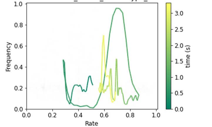
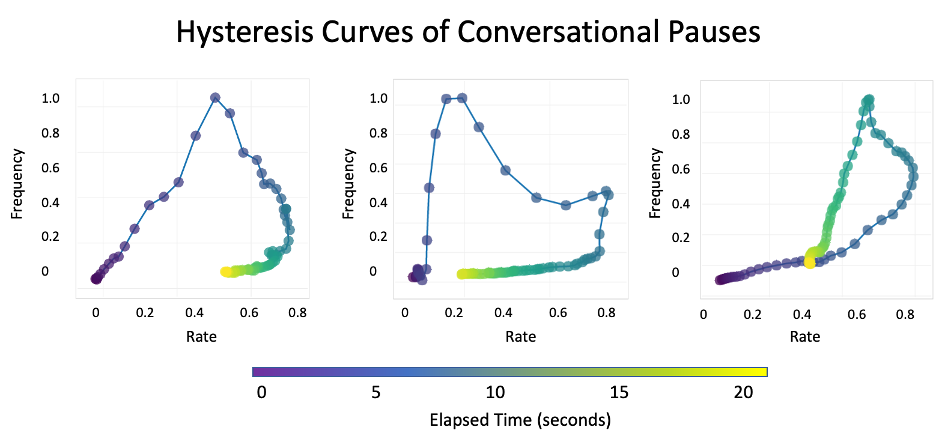
A useful method of data visualization consists of collapsing two time series data features into a “hysteresis curve”. This method takes two time series that occurs over the same time interval and compares how one varies relative to the other over conversational time (see Figure 1). These hysteresis curves are powerful because their shapes can capture the nonlinear behavior and time differential between two time series (Williams, 1989). Because these curves capture information from both time series and render them as a single image, they can highlight patterns that would not otherwise be evident and can be used for event-type clustering or other applications.
The hysteresis curve in Figure 1 displays two non-lexical components of speech: speech rate and average frequency. These time series are easily converted into hysteresis curves as they are continuous overall time and have a correlation to a specific time stamp. After these features are extracted, they are normalized to be between 0 and 1 in order to maintain the shape of the data following this equation:
Normalized Data Point = (Data Point – Data Minimum) / (Data Maximum – Data Minimum)
Figure 1: