Author: Larry Clarfeld
Posted: June 2020

The job of a data scientist is to extract meaningful patterns from data that help to better understand the subject matter, whatever it may be. In my work with the Vermont Conversation Lab, these data take the form of conversational transcripts. While some data is lost in the process of transcribing a conversation, the written words of a transcript are still a rich, multi-layered trove of information that can be analyzed in a myriad of ways. In fall of 2019, I began exploratory research to derive new methods of unlocking the hidden potential of transcripts for understanding patterns of information flow between conversational participants.
Within the existing body of literature from the field of natural language processing (NLP), there exist many complex algorithms that consider words and their meanings and how different words are juxtaposed. Whereas more complex approaches may require larger quantities of data to train or may fail to generalize because they rely so heavily on specific context, simpler methods can be easy to apply and interpret. And it was with a simple idea of how to visualize a conversation that a very powerful pattern was first recognized.
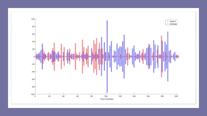
As I started working with the PCCRI conversational dataset, I devised a graphical representation of conversational data where each column in a graph represents a speaker turn, the height of each column is proportional to the turn length (in words), and the color of the column represents the speaker. This data visualization later became known as a “zipper plot” (see Figure). I began looking at zipper plots for lots of conversations and the found the deep structure of conversation leapt right off the computer monitor when visualized in this way.
One of the first things I noticed was the oscillation between short and long speaker turns. As I would later learn, this pattern is well known, but when displayed in a zipper plot, the long/short pattern is immediately apparent. The color-coding of columns also made it easy to visually distinguish who was the dominant speaker and in what part of the conversation they held the speaking floor. Zooming out, patterns of self-similarity became apparent, as conversations seemed to oscillate between each conversational participant taking turns in the dominant speaker role.
It was clear from the zipper plots that turn length was not random in any conversation, and that the length of each turn is influenced by the turns that precede it. And in this way, zipper plots were the precursor to CODYM analysis, a Markov-based modelling framework for visualizing the dependencies of speaker turn lengths in a conversation. CODYM’s have since been shown to be versatile tool, revealing such findings as a differing pattern of information flow between conversations with and without expressions of distressing emotions (Clarfeld et al, 2021).
Zipper plots are a simple way to visualize a conversation and can be generated using less than 10 lines of code in either R or Python. All you need is a table with a row for each speaker turn and two columns that describe the speaker and the turn length. Use this sample R code for making a zipper plot (Figure B) and you’ll be visualizing information flow patterns in conversations in no time:
# Sample table indicating the speaker and turn length for each turn
info <- data.frame(
speaker = rep(c(0,1),12),
turnLength = c(2,1,2,6,2,13,2,1,7,1,8,2,16,1,7,8,2,10,2,11,1,3,1,1)
)
# Set up the figure window
plot(
NA,
NA,
xlim = c(0.5,nrow(info)),
ylim = c(-max(info$turnLength)/2, max(info$turnLength)/2),
xlab = ‘Turn number’,
ylab = ‘Word count’
)
# Plot each speaker turn
for (i in 1:nrow(info)) {
points(
rep(i,info$turnLength[i]),
((-info$turnLength[i]+1)/2):((info$turnLength[i]-1)/2),
col = ifelse(info$speaker[i], ‘red’, ‘blue’),
cex = 1,
pch = 19
)
}
Reference:
Clarfeld L, Gramling R, Rizzo D, Eppstein M. A general model of conversational dynamics with application in serious illness communication. PLoS One. 2021. Jul 1;16(7):e0253124
